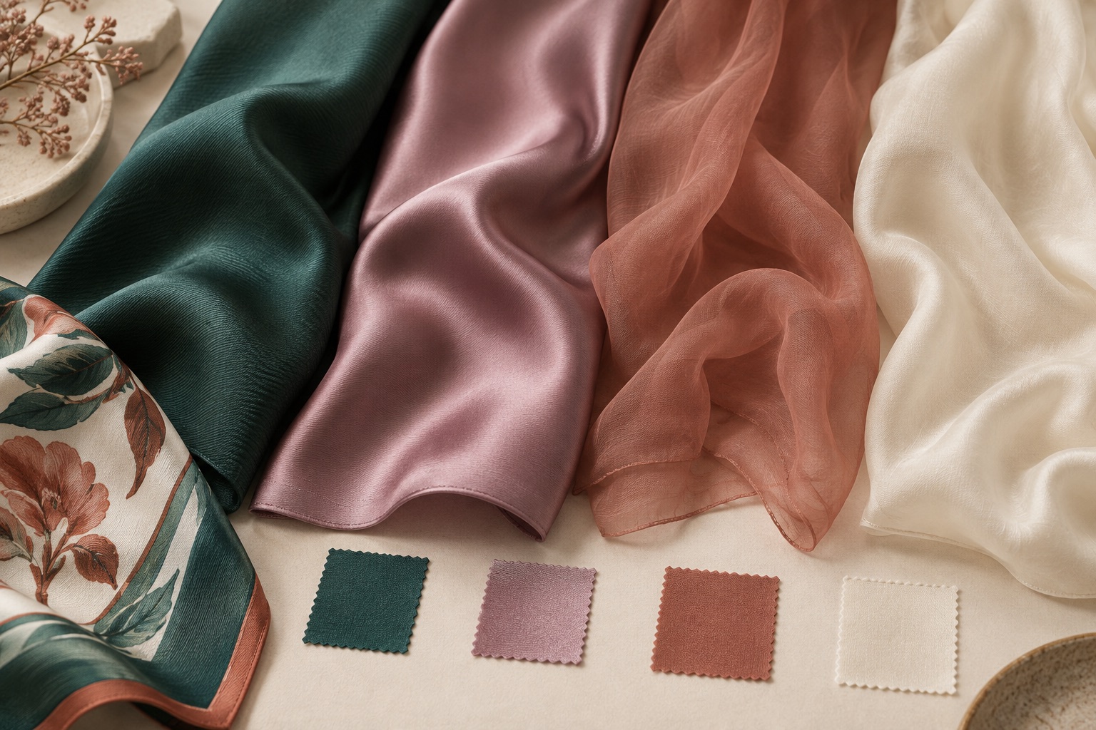
Choosing silk by name alone is difficult. A better starting point is the experience you want the finished scarf to create: structured or fluid, luminous or subtle, opaque or airy.
Begin with the way the scarf will be used
A neck scarf, a large statement square and a light summer wrap do different jobs. Think about the styling first. A compact scarf may benefit from enough body to hold a knot. A large piece may need a lighter construction so it does not feel bulky. A translucent scarf can create beautiful layers, but it will not present artwork in the same way as an opaque twill.
Also consider who will handle the scarf. Retail customers may value a distinctive handfeel and polished edge. A uniform program may put more emphasis on consistent tying and daily wear. A collectible art scarf may need a surface that carries fine detail and strong borders.
Four useful silk starting points
| Silk | Character | Often chosen for |
|---|---|---|
| Silk twill | Subtle diagonal structure, controlled drape, refined sheen | Classic squares, detailed artwork, scarves that need body |
| Silk satin | Smooth face, fluid drape, stronger surface luster | Elegant fashion scarves and color-rich designs |
| Silk chiffon | Light, airy and semi-sheer | Layering, soft movement and delicate styling |
| Silk habotai | Lightweight, smooth and softly lustrous | Everyday scarves and pieces that should feel feather-light |
Weight changes the result
The same silk family can be produced in different weights. A heavier twill may feel more architectural; a lighter twill will move more easily. Weight also affects opacity, warmth, knot size and the way an edge sits. Instead of choosing only by fabric name, ask to compare relevant weights for the size you plan to make.
A fabric swatch tells you about the silk. A finished sample tells you about the scarf.
Look at color from both sides
Silk reflects light, so a printed color can appear different as the fabric turns. A smooth satin can make highlights more obvious, while twill scatters them more softly. Chiffon introduces transparency and the background behind it becomes part of the color experience. Review important colors in natural and indoor light, and inspect both the face and reverse of the sample.
Let finishing enter the conversation early
A hand-rolled edge, a neat machine hem and other finishing choices interact with fabric weight. A delicate silk needs an edge that feels proportionate. A more structured scarf may support a stronger border. If the artwork includes a narrow frame, the planned hem allowance should be considered before the print file is finalized.
A practical selection checklist
- How will the scarf be worn, tied or displayed?
- Should it feel crisp, fluid, airy or substantial?
- How important are opacity and print detail?
- Do you want restrained luster or a brighter shine?
- Will the size create a bulky knot in this weight?
- Does the edge finish suit the material?
Choose silk as part of the design system—not after the artwork is finished. Format, weight, print and edge should be tested together in a sample.