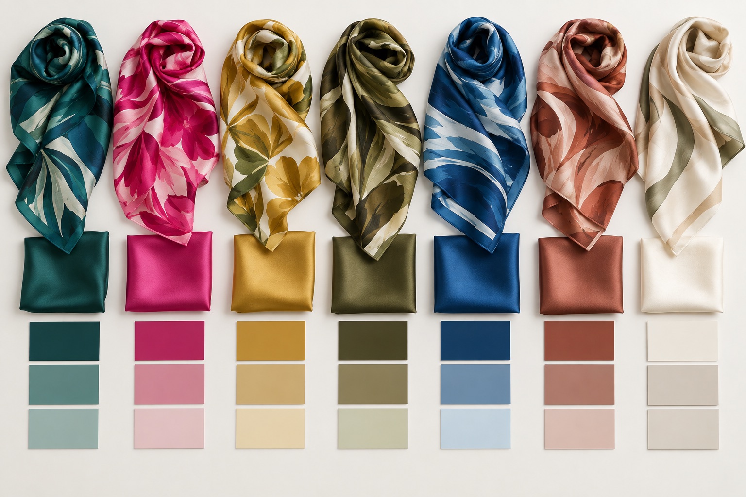
Screens emit light; silk reflects it. That simple difference explains why a digital color value cannot fully predict the finished scarf.
Silk changes as it moves
When silk turns toward a light source, highlights become brighter and some colors appear more saturated. In shadow, the same area can look deeper and cooler. Satin usually creates stronger highlights than twill, while chiffon adds transparency. Color should therefore be reviewed as part of a moving textile rather than as a single flat patch.
Define the colors that matter most
Not every color needs the same level of control. Identify the brand color, skin tone, signature red or other hue that carries the greatest meaning. Rank those priorities before sampling. This helps the print team make sensible decisions when several colors interact.
A physical reference is more useful than a screen alone. It may be a previously approved textile, a color chip or another controlled sample. Keep in mind that the reference surface will still reflect light differently from silk.
RGB and CMYK are starting information
File color spaces help describe artwork, but the final print depends on the complete textile process. Converting a value does not automatically create a visual match. Keep the original master artwork, communicate the intended appearance and review a proof produced through the actual workflow.
Approve color on the chosen silk, under useful light, at the scale the scarf will be seen.
Use consistent viewing conditions
Compare the reference and sample side by side. Look in neutral daylight and under the indoor light that matters for the product. Avoid making a decision beside a strongly colored wall or under mixed light sources. Record the conditions used for approval so later comparisons are more consistent.
Evaluate relationships, not isolated swatches
A navy beside ivory appears different from the same navy beside orange. The proportions of each color also affect the overall impression. Review the complete composition and ask whether the hierarchy feels right: is the accent too dominant, does the background stay neutral, and do neighboring hues remain distinct?
Check face, reverse and folds
Reverse-side appearance can influence styling, especially when a scarf is tied. Turn the sample over and create the folds a customer will use. A bright face with a much lighter reverse may be acceptable for one design and distracting for another. Treat that as a design decision rather than a surprise.
Create a clear approval record
- Keep the approved physical sample protected and labeled by project.
- Note which silk, weight and print method were used.
- Photograph the sample for communication, but do not replace the physical reference with a photo.
- Record any accepted variation or intentional adjustment.
- Use the same master artwork for the approved production specification.
Color matching on silk is a visual and material process. Prioritize key hues, control the comparison and approve the complete physical sample.