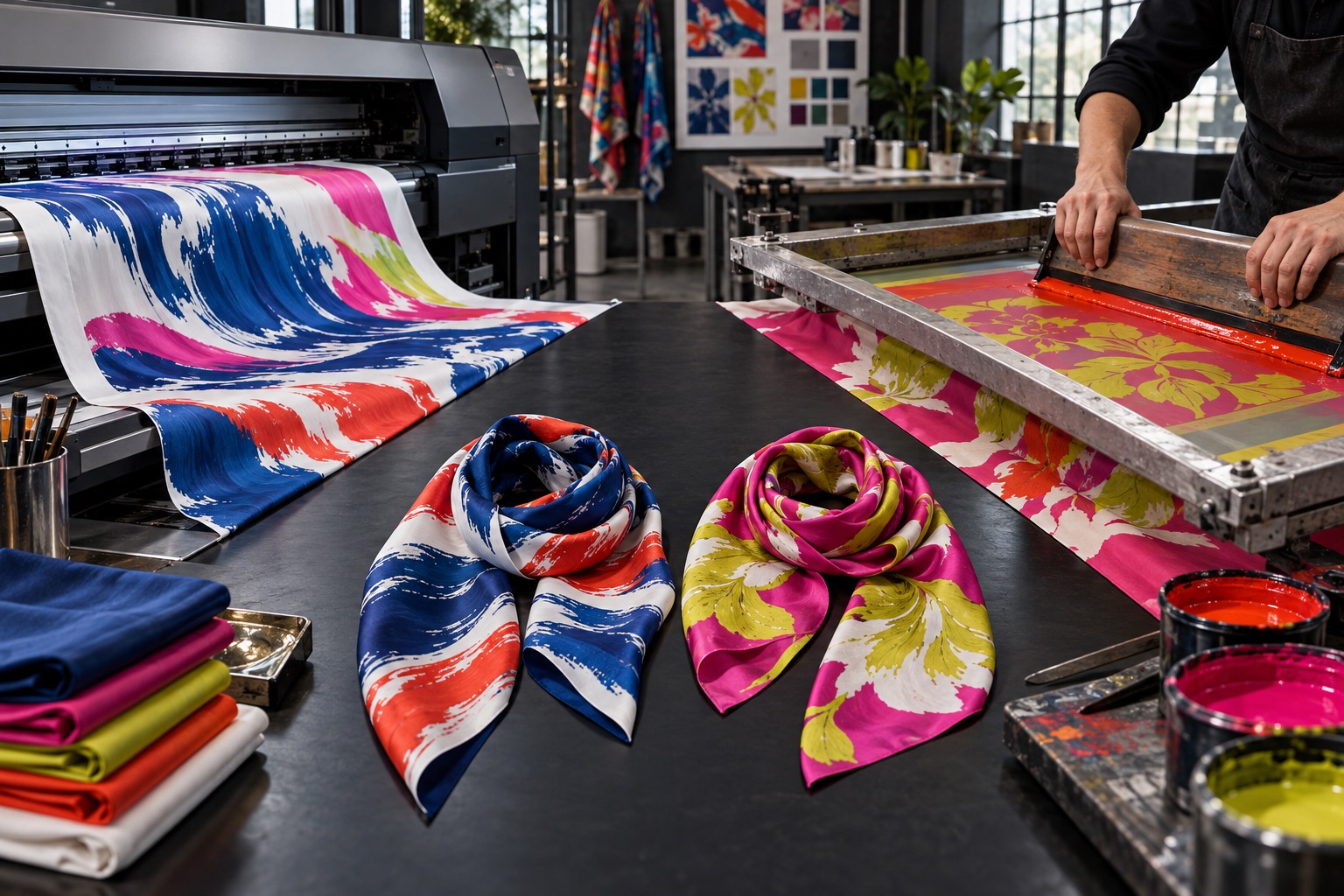
Both digital and screen printing can produce beautiful silk scarves. They solve different production problems, so the artwork should lead the choice.
How the methods differ
Digital textile printing sends artwork directly to specialized equipment, allowing many colors, gradients and fine variation without preparing a separate screen for every color. Screen printing applies color through prepared screens, traditionally one color layer at a time. That setup makes the process especially suited to controlled palettes and repeat production.
| Consideration | Digital printing | Screen printing |
|---|---|---|
| Artwork | Complex color, gradients, painterly detail | Defined color separations and graphic shapes |
| Setup | Less dependent on a screen per color | More preparation as color count increases |
| Run profile | Useful for sampling and flexible quantities | Setup can become efficient over suitable repeat runs |
| Color decisions | Managed through file, profile and sampling | Each separated ink color can be tuned deliberately |
Choose digital for visual complexity
Watercolor transitions, photographic detail, many closely related hues and soft gradients are natural candidates for digital printing. It also makes it easier to test several designs without building a full screen set for each. That flexibility is valuable for collections with varied artwork.
Choose screen printing for controlled color structure
Screen printing can be compelling when the design uses a limited, intentional palette and strong separated shapes. Because each color is part of a physical print sequence, the method rewards disciplined artwork and careful registration. It can be well suited to repeat programs once the setup has been proven.
Do not judge color from method alone
Fabric choice, pretreatment, ink system, steaming or fixation, washing and finishing all influence the result. A method name cannot guarantee vibrancy, penetration or handfeel. Review an actual sample on the intended silk and ask which colors in the design are most critical.
Choose the process that fits the artwork you have—not the artwork you think the process should prefer.
Inspect the reverse and the folded scarf
Silk scarves are seen from both sides. Color appearance on the reverse can vary with process, fabric weight and design coverage. When reviewing a sample, turn it over, fold it and tie it. A technically accurate flat print may still need adjustment if the reverse looks too weak for the intended styling.
Use the order profile as a decision input
Quantity matters, but it should not be the only factor. Consider the number of designs, colors per design, repeat expectations and how often the artwork may change. A collection with frequent limited editions has different needs from a long-running uniform scarf.
Questions for a productive print discussion
- Does the artwork contain gradients, texture or photographic detail?
- How many distinct colors require tight matching?
- Will the design repeat in future production?
- How important is reverse-side appearance?
- Which silk and weight will be used?
- Can the selected method be evaluated in a finished sample?
Compare methods through the specific scarf: artwork, silk, color priorities, quantity and repeat plan. Then let a physical sample confirm the decision.