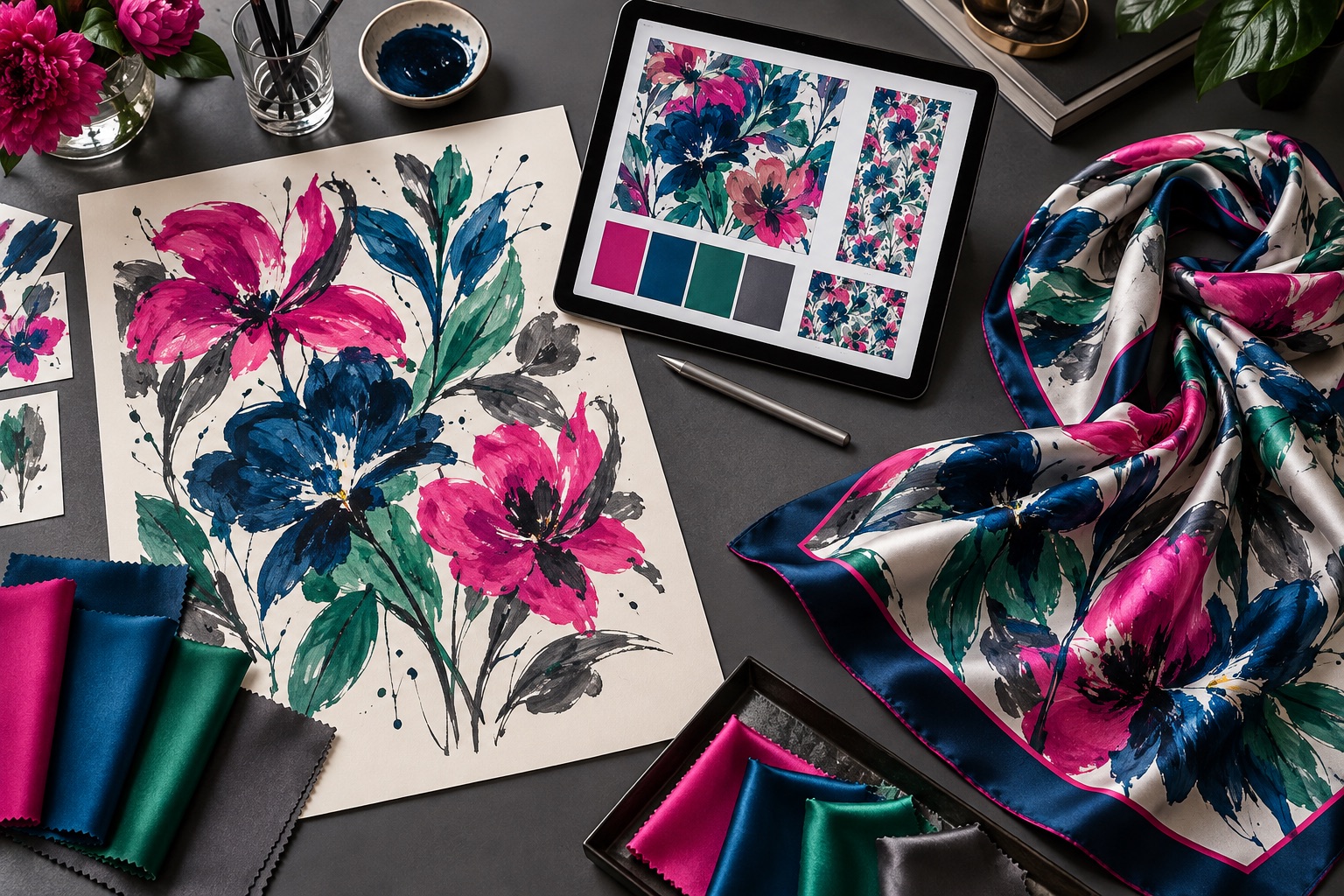
Silk moves, shines and is finished at the edge. Preparing artwork for it is different from exporting a flat image for a screen.
Build the file at final size
Set the artboard to the agreed finished dimensions and keep units clear. Designing at final size makes border width, motif scale and signature placement easier to judge. If the artwork is built at another scale, label that scale explicitly and confirm how it will be enlarged.
Use vector and raster elements deliberately
Vector artwork is useful for crisp lines, geometric borders and repeat structures. Raster artwork is often appropriate for painted textures, photographic elements and complex gradients. Both can work well, but raster images need enough resolution at the final print size. A common design target is around 300 pixels per inch, although the correct requirement depends on the print process and source artwork. Confirm the production specification before final export.
Separate important components
Keep the center artwork, borders, logos or signatures, and background on organized layers where possible. Clear layer names make adjustments faster and reduce the risk of moving the wrong element. If a pattern repeats, include a repeat tile or enough information to understand the intended join.
Plan for the finished edge
Artwork near the perimeter interacts with hemming. Ask for the finishing allowance and keep essential text, signatures or fine motifs inside a safe area. If the border must appear equal on all sides, alignment tolerance and the visible portion after hemming should be discussed before sampling.
A scarf border is both artwork and construction. Treat it as both from the beginning.
Define color expectations
RGB values on a bright screen are not a physical color standard. Provide color references when specific hues matter, and note which colors are most important to the brand or composition. A paper proof can help with layout, but a print on the selected silk is the meaningful color review because luster and fabric weight influence perception.
Watch very fine details
Hairline strokes, tiny lettering and low-contrast textures may not reproduce as they appear on screen. View the file at final physical size and identify details that must remain crisp. It is often better to strengthen a key line or simplify a tiny feature than to discover it disappears in the sample.
Package the handoff clearly
- Include the editable master file and a flattened visual reference.
- Link or embed placed images according to the requested file setup.
- Outline fonts or supply them when licensing permits.
- State final dimensions and orientation in the file name or project note.
- Identify the approved color reference and intended silk.
- Mark any element whose placement must not change.
Review the sample as a physical object
Lay the sample flat, fold it, tie it and view it at different distances. Check whether the visual center is where you expected, whether the border stays balanced, and whether important motifs survive common folds. Small file changes made at this stage can produce a much more resolved production piece.
Supply a clear, final-size master file, but keep the handoff flexible enough for practical adjustments after the first silk sample.