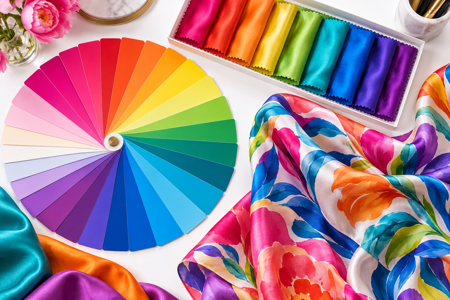
Color is one of the first things customers notice in a scarf. Pantone references help a designer and factory discuss the same intention, but paper ink, emitted screen light and dye on lustrous silk are different visual systems.
Choose the correct reference system
State the exact Pantone library and code rather than providing only a number. Coated, uncoated, textile and other systems are not interchangeable. If the color comes from an existing product, sending a physical master swatch can be more useful than translating it through an unknown screen profile.
Why silk changes color perception
Silk reflects light differently as it moves. Twill, satin, habotai and chiffon have different surfaces, densities and levels of sheen. The same printed formula can therefore look deeper, brighter or softer across fabrics. The unprinted base color and any finishing wash also influence the result.
Separate brand-critical and supporting colors
Identify which colors must receive the closest control. A corporate blue, institutional red or signature cosmetic shade may be critical, while small supporting colors can work within a broader visual tolerance. Prioritization helps the print team focus evaluation where it matters most.
Use a physical strike-off
A strike-off is a printed fabric test made before the final sample or bulk production. Review it on the correct silk under controlled neutral light, then check it in the environment where the scarf will be sold or presented. Do not approve solely from a phone photograph; cameras and displays introduce their own interpretation.
Judge relationships, not isolated chips
A color changes visually beside another color. Check whether dark outlines remain open, pale tints stay distinct and adjacent hues have enough separation. Large areas may feel stronger than small color chips, so review the complete composition as well as the individual target.
Record approval against a dated physical sample, not an informal description such as “slightly warmer.”
Control colorways consistently
For several colorways, confirm whether each has its own independent targets or shares a limited palette. Use clear artwork names and a color table for every version. Keep approved strike-offs so later reorders can be compared with the same physical reference.
Allow realistic tolerance
Textile printing is a controlled production process, but fabric lots, dyes, humidity and finishing can introduce minor variation. Agree on acceptable tolerance with the factory and use inspection to identify material differences rather than expecting silk to behave like a backlit screen.
Pantone codes are excellent communication tools. For production, combine them with the chosen silk, neutral lighting, a physical strike-off and clearly ranked color priorities.