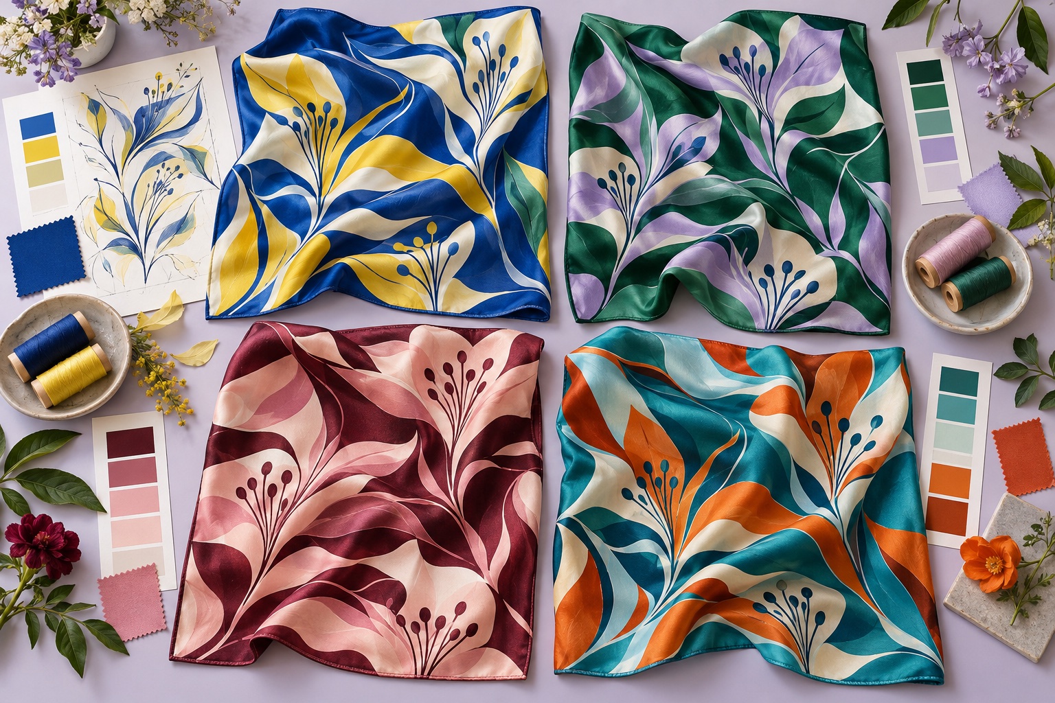
Multiple colorways can widen the audience for one scarf design, support different seasons or create options for several stores and teams. They also multiply decisions. A controlled system helps the range feel intentional and keeps artwork, sampling and production manageable.
Define what stays fixed
Begin with the master artwork and separate fixed elements from variable ones. The motif scale, border width, logo position and linework may remain constant, while the ground, main motif and accent colors change. Recording this distinction prevents every colorway from becoming a separate redesign.
A shared structure gives the collection recognition at a distance. If all design variables change at once, the result may look like unrelated scarves rather than one coherent family.
Assign color roles before choosing shades
Identify functional roles such as ground, dominant motif, secondary motif, outline, border and highlight. Then create a palette for each colorway using those roles. A cobalt ground may need a light motif and warm accent; an ivory ground may require a darker outline to preserve the same readability.
This is more reliable than replacing every color one for one. Equal digital values do not create equal visual weight, and some hues appear stronger or lighter after printing on silk.
Give each colorway a reason to exist
Write a one-line purpose for every version: summer resort, autumn retail, corporate navy, gallery brights or a regional exclusive. Define the customer, season, styling context and nearby products. The purpose guides decisions when several attractive palettes compete.
A simple planning matrix can list the colorway name, hero colors, intended market, matching collection pieces, approved references, quantity and status. It makes gaps and unnecessary duplicates visible before sampling.
Preserve contrast and focal hierarchy
Convert early mockups to grayscale to compare light–dark contrast. The main motif and border should remain legible in every version, especially after folding. Check tiny details at final print size; lines that work on screen may merge when the contrast is reduced.
View each scarf flat, folded and tied. A beautiful central composition is not enough if every visible fold looks identical or an important accent disappears. For square formats, our custom square scarf page shows how borders and corners influence styling.
Design for silk, not the monitor
Silk reflects light, so the same printed color changes as the fabric moves. Weave, weight, printing method and finishing also influence saturation and reverse-side appearance. A pale pastel may become delicate; a deep dark ground can show surface luster and handling marks differently.
Use calibrated digital mockups for direction, then move to physical references and print tests. Review our guides to color matching on silk and using Pantone references before approving production colors.
Control the border, logo and signature elements
A consistent border color or line treatment can unite very different palettes. If the logo must remain in a fixed brand color, test its contrast against every ground. If it can reverse between light and dark, document the approved variant for each colorway.
Check whether the hem thread should match the border, ground or another specified color. Edge decisions are highly visible on a finished scarf and should not be left to interpretation.
A colorway is successful when it feels new without making the customer relearn the design.
Prepare production-ready color files
Create one named file for every approved colorway and keep the geometry identical. Use a clear naming convention that includes design, colorway, size and revision. Provide color callouts, a small visual key and any approved physical references. Avoid names such as “final blue new” that become ambiguous after several revisions.
List each version separately in the tech pack, including artwork filename, silk, finished size, print method, hem, label and packing. Record the approval date and retain an approved sample for later inspection and reorders.
Choose a sampling strategy based on risk
If color is critical, sample on the actual silk and review under more than one light source. A shared pattern does not guarantee that every palette will print equally well. Dark grounds, subtle tonal combinations and vivid high-contrast colors may each present different risks.
Prioritize physical tests for the most technically demanding colorways, but do not assume an untested version will behave exactly like the first. Confirm the factory’s recommended strike-off or sample plan in the quotation and define who approves each version.
Plan quantities by colorway
Demand is rarely equal across a range. Estimate quantity for each version using channel, market, preorder or uniform allocation data. Custom orders from this factory start at 50 pieces, but buyers should confirm in writing how the minimum applies when an order contains several colorways, sizes or silk specifications.
Typical sampling takes 3–5 days after artwork and product details are confirmed. Typical bulk production takes 15–25 days after sample approval and final order confirmation, with shipping added afterward. More versions create more approvals, so build decision time into the launch calendar.
Inspect and reorder as individual specifications
During bulk inspection, compare each colorway with its own approved reference. Do not use one version to judge another. Verify ground and accent colors, registration, border position, dimensions, hem, labels and packing. Store the approved sample and file record under the same colorway name.
For reorders, provide the original specification and ask for a fresh color comparison. Raw material and production lots can vary slightly; a documented reference makes the acceptable target much clearer.
Build colorways as one controlled system: fix the pattern structure, assign color roles, give every palette a purpose and approve each production version against a clear physical reference.